Clearlink

Timeline

2021 - Present

My Role

UI/UX Designer

All (design) systems go

Working at Clearlink has given me invaluable experience in working with a complex design system. Nicknamed "Coolwhip II," the system allowed content editors to build pages from scratch and drag-and-drop elements on the page at will.

I was brought on as the Web & Product Designer for the Business.org and Reviews.org sites, working with a full team of writers, editors, marketers, and SEO experts.

The Figma Switch

After nudging our team into making the switch from Sketch to Figma, I took on the task of rebuilding our design system documentation in Figma, and making much-needed updates in the process.

Striving to take advantage of what Figma could offer, I rebuilt each of our elements/sub-components and components from scratch with component properties, variables, and auto-layout. This allowed us to stress-test and prototype our components in a way we couldn't do with Sketch, and improve the fidelity between how our components looked in Figma and how they looked on the site.

I also wanted to make the documentation easier to read, so any stakeholder could look at the file and understand all the pieces that go into our design system. I went through our Sketch documents with members of our design, development, and editorial teams, to find pain points and decide what was essential for the new documentation

After showing the completed Figma file to our development team, I received two highly-coveted words in reaction, which I will cherish the rest of my career: "chef's kiss."

I then walked the rest of our product design team through the new documentation, and completed some sample tasks. We found that some maintenance tasks that previously took upwards of an hour to complete in our old files, would now take about 10 minutes. It's hard to quantify "designer time saved" with a project like this, but that felt like a great indicator of how much better this documentation was.
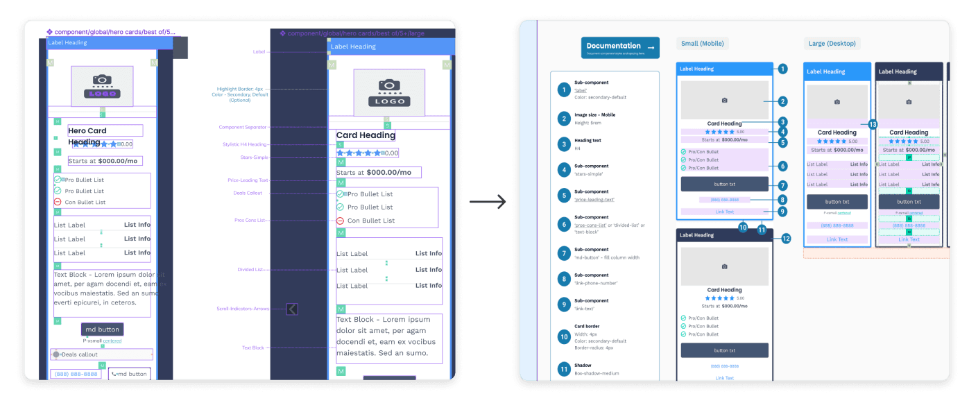
Our component documentation was getting difficult to scan, with some callouts getting overlooked or lost. With a "numbered pin" approach, our styling and callouts could be easily read at a glance.

The Prototype

Thrown straight into the fire, my first 8 weeks involved helping to oversee the migration of Reviews.org into our new design system.

Since the design work was already completed by the time I joined the team, my role was to create new page templates, QA all the new design styling, and help the content team clean up all 1,800+ pages for the final "Coolwhip II" launch.

The only way to fulfill that role effectively within weeks of joining the team? Learn the design system as quickly as possible. Thankfully I had the help of my manager and director to give me the crash course and answer my questions, as I studied our internal site guides and design system documentation.

Once the migration was done, I received a huge compliment from one of the members on the Reviews.org team. They assumed I had worked there for years, and would never have guessed I was a brand new employee!

The Lending Tool

Business.org wanted to help small-business owners better understand their lending options.

The team had the idea of creating a simple questionnaire tool that would give business owners a lender recommendation based on their revenue, credit score, and the age of their business.

Along with the team's content strategist, we created an entire user experience for this questionnaire using ShortStack and some custom HTML and CSS. We also had it user tested among team members, and were able to incorporate the feedback before the first "official" V1 launch.

Since being added to select pages on the site, the tool has resulted in a significant increase in link clicks to our recommended lenders.

The Deals Experience

How can we add deals and savings to our content offerings using elements in our design system?

As our content team sought to provide more deals and savings to our users, I was tasked with finding the best way of incorporating deals into our design system.

I consulted stakeholders on the content and engineering teams, trying to answer some key questions about the implementation:

  1. How are deals currently being displayed?

  2. What are the pain points with curating and posting deals?

  3. What could a more extensive deals experience look like in our design system?

With feedback in hand, I could begin exploring the implementation, in a project that is still ongoing...

© 2024

© 2024

© 2024