
Personalized internet comparison shopping
I was the sole designer for a full redesign of HighSpeedInternet.com's internet comparison feature.
My role
Sole designer
Timeframe
4 months
Collaborators
User Researcher
Product Manager
Visual Designer
How it started
After years of resisting, HighSpeedInternet.com was finally ready to try a redesign of their most critical component: the "internet provider" card.
HighSpeedInternet.com's bread-and-butter is their geo pages, a list of "internet provider" cards showing available internet within that city or zip code. Aside from a few tests and tweaks, the cards had remained largely the same for several years.
Knowing that we needed to keep revising and innovating within the internet marketplace space in order to keep up with competitors, I was vocal about trying something new with our provider cards. After some time, we were able to agree on a new "provider card playground" where we could test new card designs to a limited audience, without affecting the primary geo page experience.
I was ecstatic. A full redesign of a years old, high-impact component? Absolutely. Yes please.
How it went
I started with a full team workshop, a chance to hear from everyone on the team, from editorial to paid media. We put aside all technical limitations and notions of "what has always been," and started with a blank slate. What do users need on this page to compare internet providers? What do they need to know and what do they need to feel?
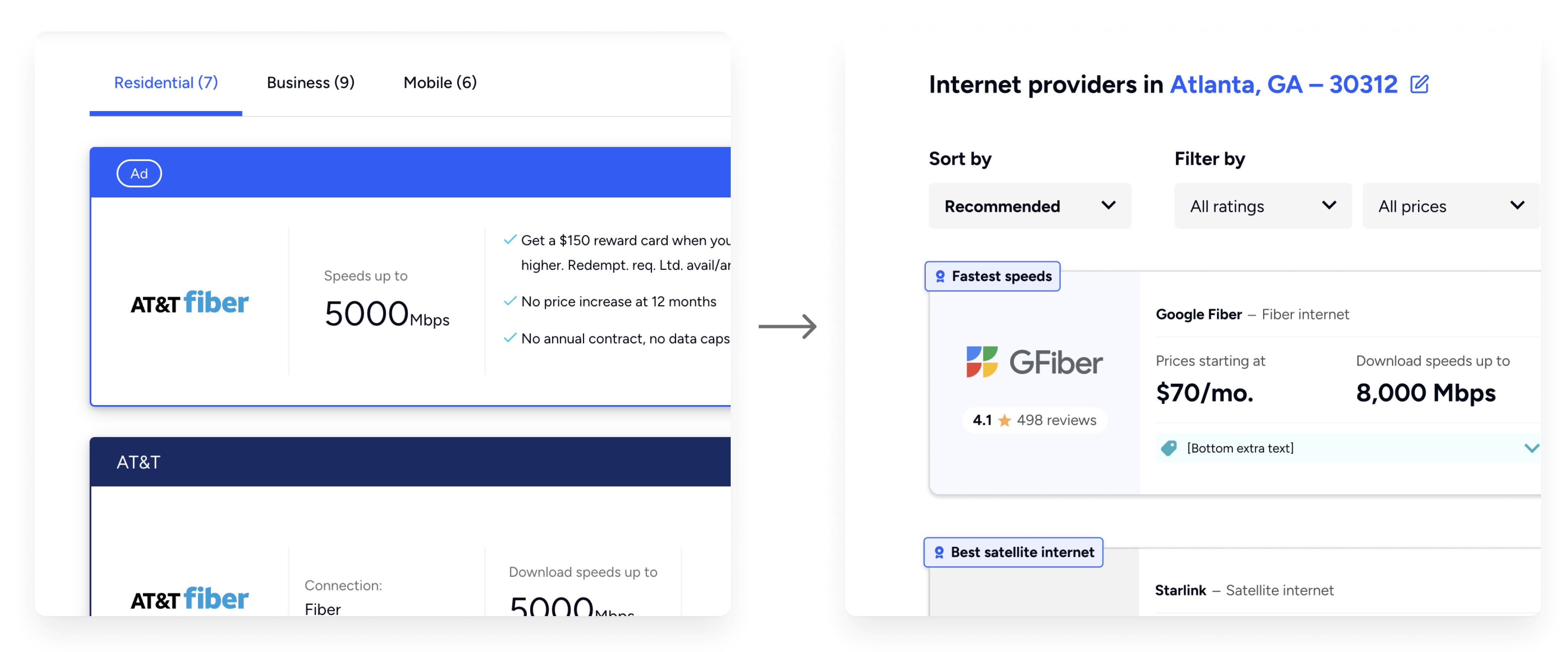
From there I began work on initial layouts and wireframes. What datapoints were most important to users? How do they sort through the cards? Where's the sweet spot between "too much data" and "not enough data" to make a decision?
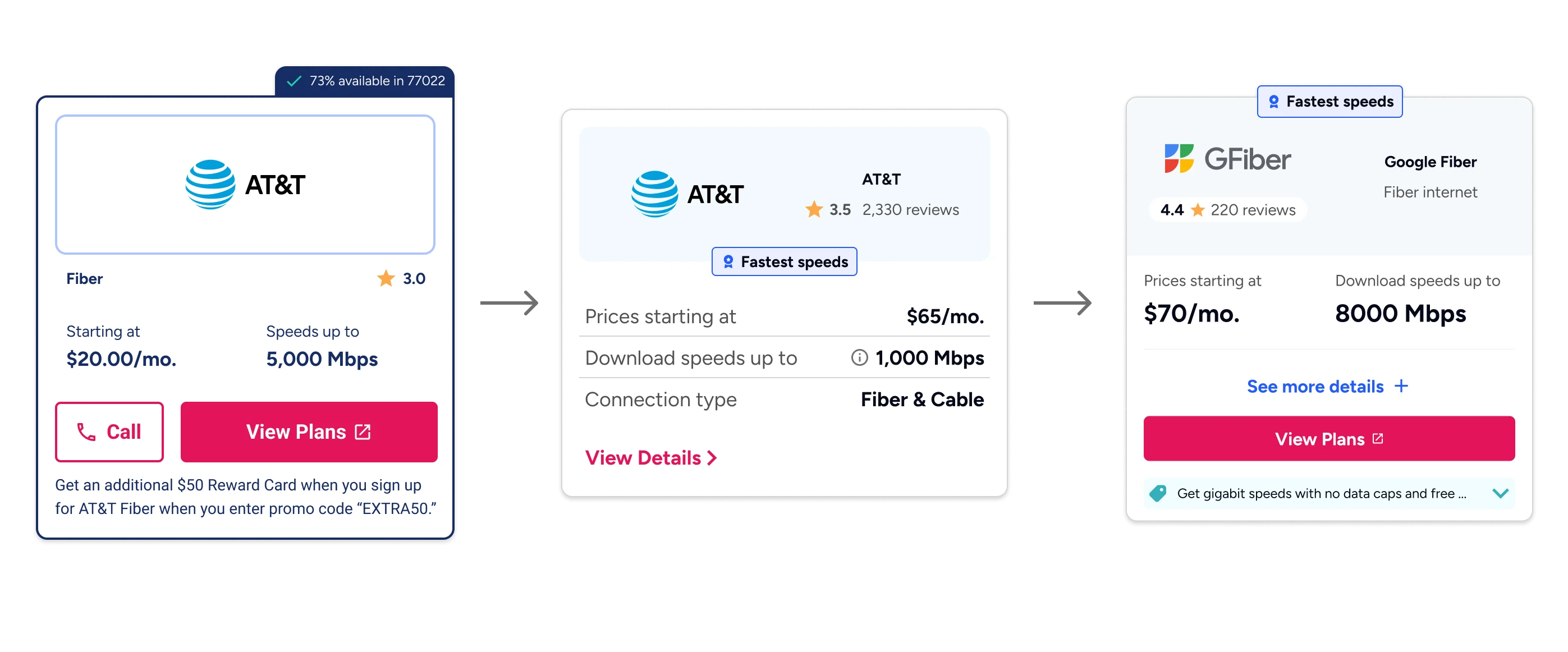
The provider cards went through several iterations, each one balancing the amount of datapoints required for users to make an educated comparison without creating cognitive overload.
I worked with our UX researcher to test the designs, creating working prototypes for her to test in guided research sessions. Just a few of things we learned:
Hierarchy and spacing is critical. If items aren't grouped properly, users can feel lost and not know where to start within each card.
Users were split on the amount of information they wanted. Some were "power users" who wanted all the data at their fingertips right away. Others were "casual users" who didn't need to know all the specifics before making a decision. Is it possible to accommodate both at the same time? (Answer: we sure tried!)
Don't overcomplicate! We started with some bold ideas on what could make these cards unique. The whole card is clickable, without the need for a button! Clicking the card brings up a modal with more details! The same card design on desktop and mobile! But users kept going back to the more traditional patterns we had come to rely on with provider cards, so the design followed suit.
After 5 total prototypes and rounds of testing, we landed on a brand new provider card experience. An expandable card that contained both qualitative and quantitative data for the user to sort through.
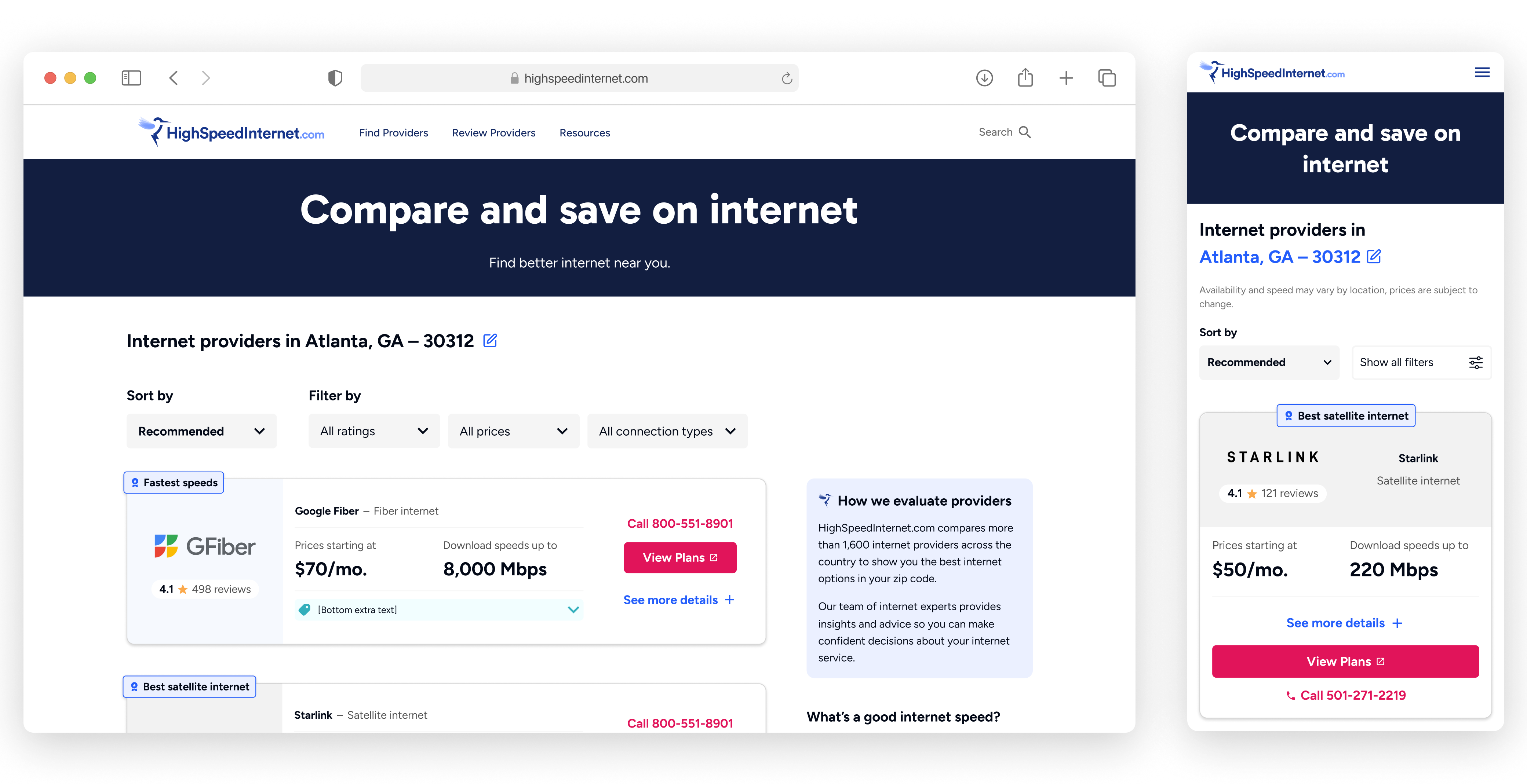
This version of the provider card experience added more robust sort and filter features, as well as a sidebar for adding additional context for users.