
Prototyping a new user-centric product offering
Prototyping a new HighSpeedInternet.com product to prove its value to leadership. After testing with real users, the product tripled conversion.


My role
Sole designer
Timeframe
3 months
Collaborators
User Researcher
Product Manager
Visual Designer
The Opportunity
Over the course of working on HighSpeedInternet.com, I could see a major disconnect between what mattered to users and what our product offered.
Consistently, users’ number one criteria for choosing an internet provider is the price. Our provider cards could easily display the price, but since each provider has multiple plans and price points, we were limited to showing price ranges instead of specific plan prices, creating a frustrating point of ambiguity.
At the same time, users often described feeling overwhelmed by download and upload speed numbers, not knowing what speed was best for their household. We had an interactive quiz for this, but it gave an outdated speed range and provided little additional help in finding plans in their area.
The solution? An interactive quiz that could provide users a recommended internet speed and a list of internet plans with that speed, rather than a list of ISPs and price ranges.
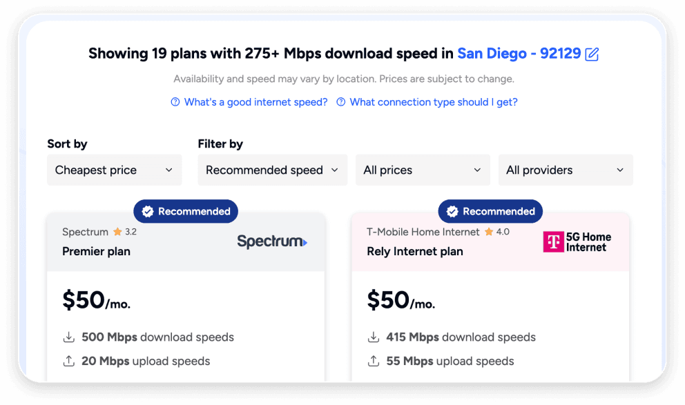
More than anything else I wanted to provide users with a no-nonsense comparison between actual internet plans, showing them what matters most when choosing internet.
The Work
How I pitched this to team leadership:
“Imagine you’re on a website looking for a new credit card. Instead of showing you all the cards available to you, the site only shows a list of banks that offer credit cards, with no way to see their full credit card offerings. Would you be able to pick a credit card on that site?”
This is what our “internet provider cards” were essentially doing. Provider-level data only, with few specifics. My solution, the Internet Plan Finder, would drastically improve this experience.
I started designing and AI-coding a prototype. The plan finder would start with a few general questions about the user’s internet usage, ask for their zip code, and then give a recommended internet plan—basically the cheapest plan in their area that had their recommended download speed.
I used only non-proprietary data from our internal provider database, adding it to a separate database to prevent any security issues, and made sure to get the thumbs up from our VP of product before doing so. This database had prices and speeds at the plan level, rather than just ISPs, and a list of zip codes those plans were available in.
When I had something interesting enough to share, I got buy-in from my product manager to pursue this project during work hours and eventually test it.

I developed a system for making each card's top banner be a lighter version of that provider's primary brand color. I wanted plans from the same provider to be grouped together visually, without relying solely on the logo.
The Test
Once we had a working prototype, we tried a low-risk testing strategy: a simple button callout on a collection of geo pages offering to help users find an internet plan.
After gaining enough traffic and users interacting with the plan finder, we noticed that while click-through rates to ISPs was lower, the conversion rate for users once they had arrived there had tripled, from 1% to 3%. This appeared to match our hypothesis. Users would do more research on our site, before arriving at a provider’s site with a stronger intent to sign up.
Finally, a clear metric to prove the value of a stronger shopping experience! This work earned stakeholder buy-in that cleared the way for the product to scale, shaping decisions well beyond its original scope.